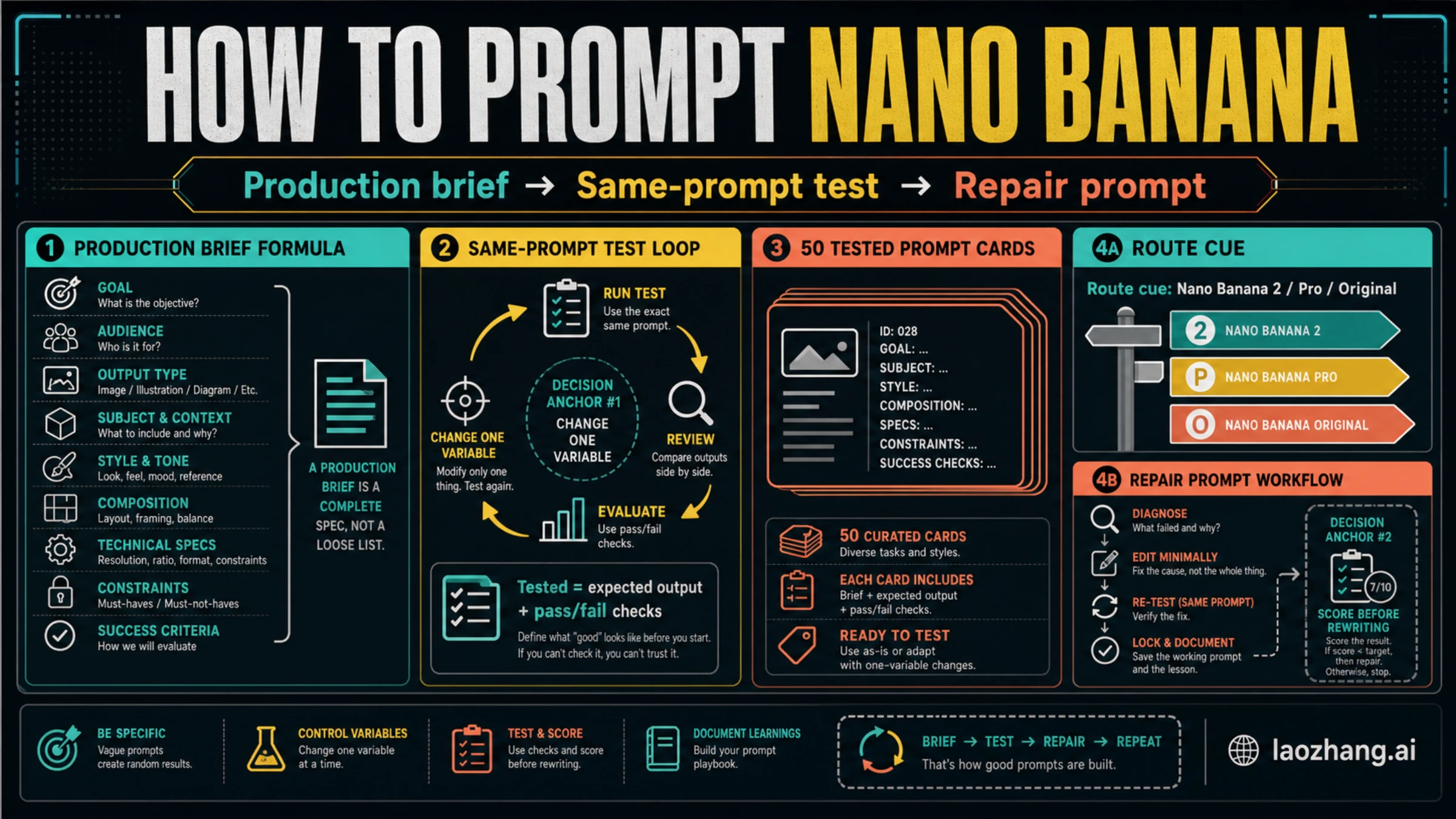
Good Nano Banana prompts work best as production briefs: define the subject and job, add context, composition, style, constraints, and the success check before you generate. Use Nano Banana 2, Nano Banana Pro, or the original Nano Banana as a route cue, but keep pricing, quotas, and availability out of the prompt workflow unless you are reading a current route guide. A template is only useful when it says what result should appear, what failure would invalidate it, and how to repair one failure without rewriting the whole prompt. Start by choosing one card, locking the subject and aspect ratio, running a baseline, scoring the output, and changing one variable at a time.
Quick Start Workflow
Use this five-step workflow before copying any template.
- Pick the closest prompt card for the job, not the most stylish wording.
- Replace every variable with concrete nouns, reference details, and constraints.
- Run a baseline without changing the model route, aspect ratio, or subject.
- Score the output against the card's expected result and pass/fail checks.
- Repair one failure at a time, then re-test the same prompt.
That order matters. Most bad image prompting comes from changing too many things after the first miss: the subject changes, the style changes, the camera changes, and nobody knows which change improved or damaged the result. A Nano Banana prompt becomes repeatable when the prompt card records the job, the variables, the expected result, and the next repair move.
For route context, Google's current image-generation docs map the family this way: Nano Banana 2 is gemini-3.1-flash-image, Nano Banana Pro is gemini-3-pro-image, and the original Nano Banana is gemini-2.5-flash-image. Use those IDs as a route cue when API control matters, but do not treat the model name as a substitute for a clear prompt. If the real question is access, cost, or image-model selection, start with the broader Nano Banana AI image generator guide, the Gemini 3.1 Flash Image guide, or a pricing-specific sibling such as Gemini 3 Pro Image API pricing.
Prompt Anatomy
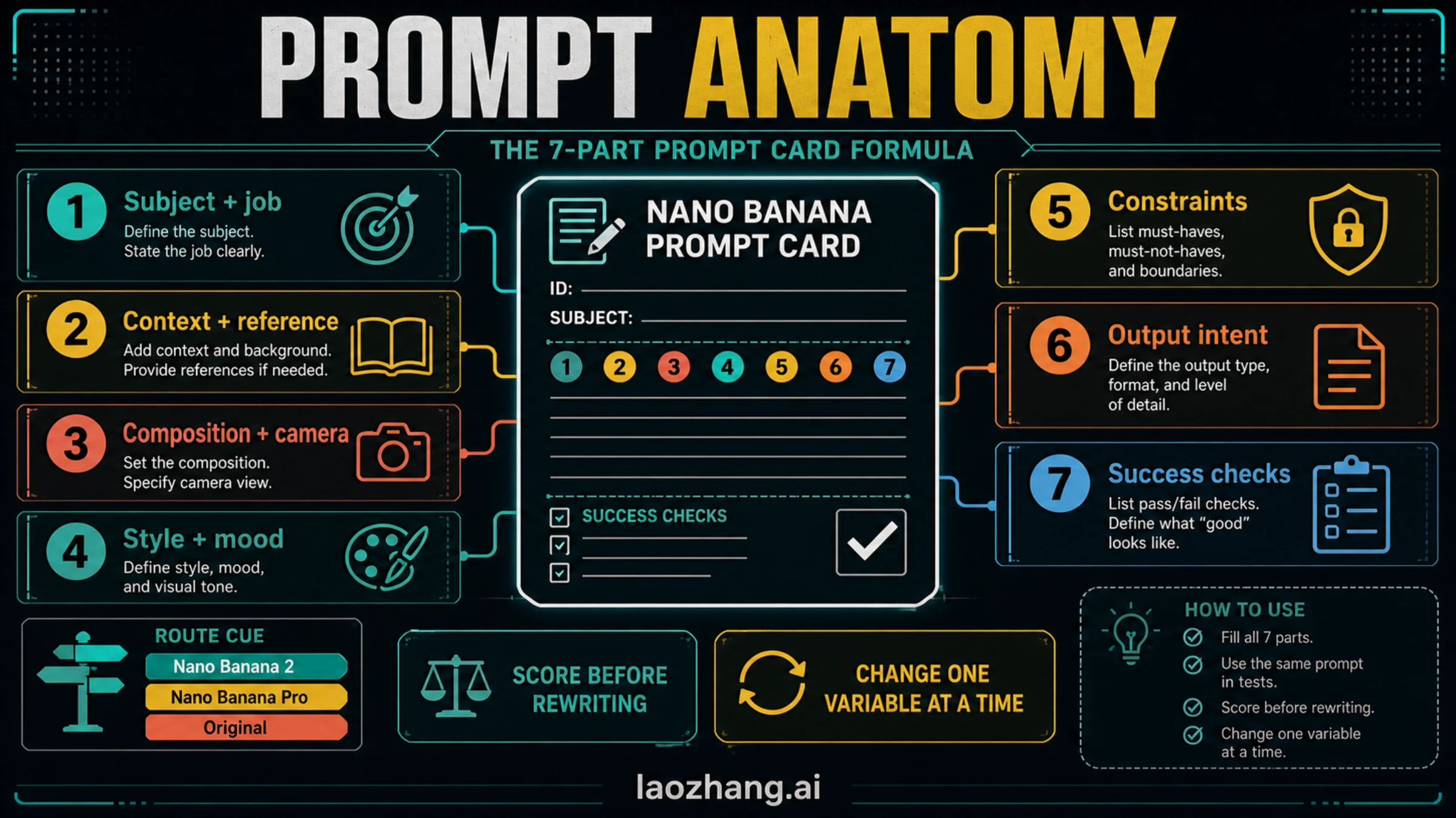
A good prompt card has seven parts. You do not need all seven to be long, but each part should be deliberate.
| Prompt part | What to write | Pass/fail check |
|---|---|---|
| Subject + job | The exact thing being made and what it must do | A stranger can name the subject and purpose from the output |
| Context + reference | Brand, environment, source image, audience, or scenario | The output does not drift into a generic scene |
| Composition + camera | Framing, angle, crop, distance, layout, or spatial relationship | The generated image places the subject where the job needs it |
| Style + mood | Medium, visual genre, lighting, texture, and tone | Style supports the subject instead of overpowering it |
| Constraints | What must be included, excluded, preserved, or avoided | The output respects the hard boundaries |
| Output intent | Where the image will be used and what format matters | The image fits the final use, not just the prompt wording |
| Success checks | How you will judge whether the generation worked | You know what to fix without rewriting the whole prompt |
Google's own Nano Banana prompting guidance emphasizes specificity, positive framing, subject/action/location/composition/style details, reference-image instruction, iteration, and typography rules. The practical translation is simple: write the prompt as if you were briefing a designer who has one attempt to understand the job.
A compact production-brief formula looks like this:
textCreate [subject] for [job/audience].
Use [composition/camera/layout] in [style/medium/mood].
Keep [constraints/preserved details].
Avoid [failure mode].
Output should be judged by [success checks].
The formula is intentionally plain. Nano Banana does not need mystical language. It needs enough structured context to avoid guessing.
Same-Prompt Testing
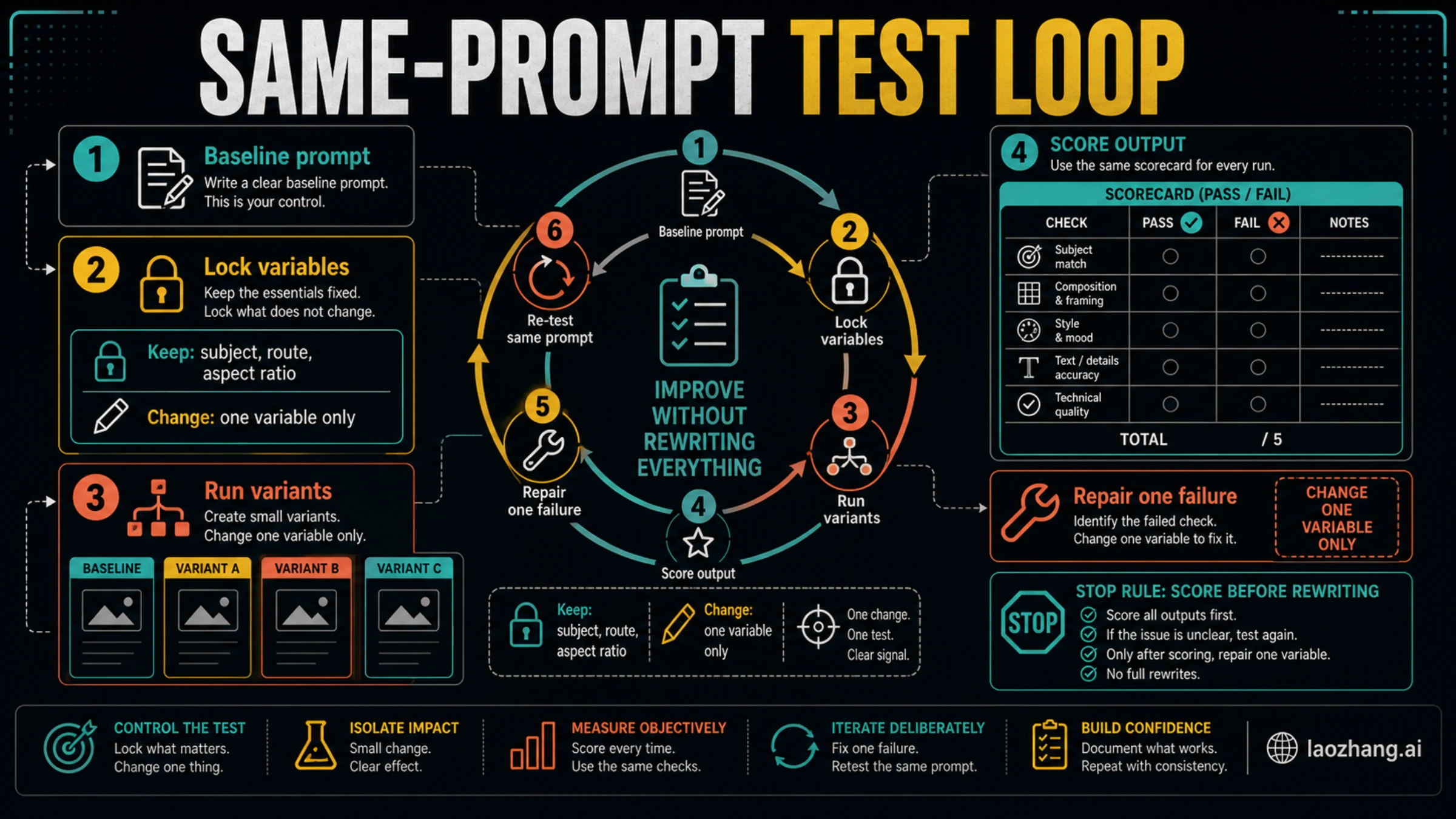
Testing a prompt is different from liking one lucky output. Use a scorecard before changing the prompt.
| Check | Score 0 | Score 1 | Score 2 |
|---|---|---|---|
| Subject fidelity | Wrong subject or major drift | Correct subject with visible distortions | Correct subject and preserved identity/details |
| Composition | Cropped, cluttered, or off-layout | Usable but needs framing work | Clear layout and correct focus |
| Style control | Style overwhelms the job | Style is close but inconsistent | Style supports the task |
| Text and labels | Unreadable or wrong | Some readable text, some errors | Clean enough for intended use |
| Constraint compliance | Violates hard boundaries | Mostly follows constraints | All important constraints followed |
Run the baseline first. Then lock the subject, route, aspect ratio, and major composition. Change one variable: shorter copy, tighter camera angle, stronger constraint, cleaner reference instruction, or less style language. If the score improves, keep the change. If it does not, roll it back and repair the next failure.
That is why every usable prompt card needs a repair prompt. A repair prompt should be targeted:
textKeep the subject, composition, aspect ratio, and overall style from the previous result.
Fix only [one failure].
Do not change [locked details].
The phrase "fix only" is not magic, but it gives the model a narrower edit job. That narrow job is easier to evaluate than a full rewrite.
Route Boundaries
Nano Banana route names are useful, but they do not replace prompt discipline.
Use a route cue when the job depends on model access or API control:
- Use Nano Banana 2 as the working all-around route cue when the task is general image generation or editing.
- Use Nano Banana Pro as the cue when the job is final-asset, text-heavy, layout-heavy, or diagram-oriented enough to justify checking a higher-fidelity route.
- Use original Nano Banana only when you are intentionally targeting the older
gemini-2.5-flash-imageroute.
Keep two boundaries in mind. First, model IDs, availability surfaces, quotas, and prices can change, so route facts belong in current route or pricing pages, not inside a prompt template. Second, Pro is not an excuse to write a vague prompt. A higher-fidelity route can still fail if the brief hides the subject, mixes incompatible styles, or asks for too much text.
50 Nano Banana Prompt Templates
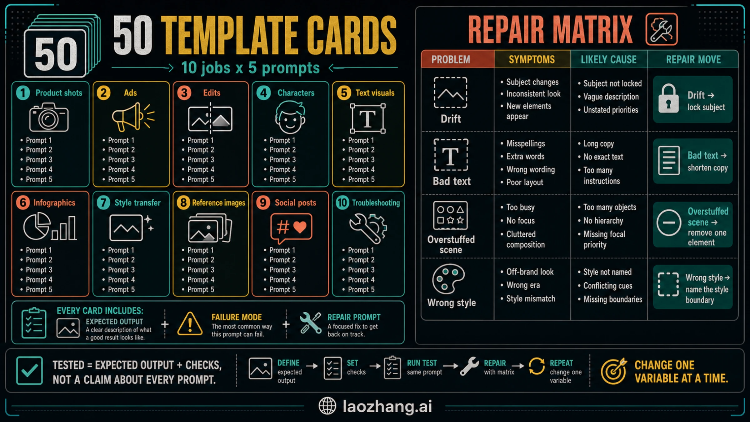
These prompt cards are not claims that every row was generated and hand-scored before publication. Each card is "tested" in the operational sense: it defines the expected output, the failure to watch, and the repair move. Fill the variables, run a baseline, score the result, and repair one failure.
Product Shots
| # | Prompt card | Expected output | Failure to watch | Repair prompt |
|---|---|---|---|---|
| 1 | Create a premium studio product photo of [product] for a landing page hero. Use a clean [surface], soft directional light, a 3/4 camera angle, and enough negative space for headline copy. Keep packaging details legible. Avoid extra props. | A clean hero image with the product as the obvious subject | Too many props or illegible packaging | Keep the same product and angle. Remove extra props and make the packaging text area cleaner. |
| 2 | Create a close-up macro product image of [material/detail] on [product]. Show texture, edge quality, and craftsmanship. Use shallow depth of field, realistic highlights, and a neutral background. | Detail shot that sells texture or build quality | Texture becomes plastic or over-sharpened | Keep the crop. Make the material texture more natural and reduce artificial sharpening. |
| 3 | Create an ecommerce catalog image of [product] on a pure neutral background. Center the product, show true proportions, preserve color accuracy, and avoid lifestyle props. | Marketplace-ready catalog image | Background or perspective looks stylized | Keep the product centered. Use a flatter catalog perspective and remove stylized lighting. |
| 4 | Create a before-and-after comparison for [product improvement]. Left side shows [old state], right side shows [new state]. Use identical framing, clear separation, and minimal labels. | Comparison image with controlled framing | The two sides use different camera angles | Keep both panels aligned. Match camera angle, distance, and lighting across before and after. |
| 5 | Create a bundle product image showing [main product] with [accessories]. Use tidy spacing, realistic scale, and a premium but simple studio setup. Do not add unrelated items. | Bundle image with accurate hierarchy | Accessories overpower the main product | Keep all items. Make the main product larger and reduce accessory prominence. |
Ads And Campaign Concepts
| # | Prompt card | Expected output | Failure to watch | Repair prompt |
|---|---|---|---|---|
| 6 | Create a social ad visual for [offer] aimed at [audience]. Show [subject] solving [problem]. Use bold composition, one clear focal point, and space for short headline text. | Campaign image with obvious benefit | Scene looks like stock art without the offer | Keep the audience and subject. Make the problem-solution moment more visible. |
| 7 | Create a seasonal campaign image for [product] during [season/event]. Use [palette], [setting], and a tasteful celebratory mood. Keep the product realistic and central. | Seasonal image without losing product focus | Seasonal decoration dominates | Keep the season cue. Reduce decoration and restore product as the main subject. |
| 8 | Create a split-screen ad concept showing frustration before [solution] and relief after [solution]. Use matching composition and readable emotional contrast. | Problem-solution ad concept | Before and after look unrelated | Keep the split screen. Match the subject and camera angle on both sides. |
| 9 | Create a premium brand image for [brand/product category] with [visual metaphor]. Use restrained lighting, strong silhouette, and no exaggerated claims. | Brand image with clear metaphor | Metaphor becomes confusing or literal | Keep the product. Simplify the metaphor so the benefit is understandable in one glance. |
| 10 | Create a mobile-first vertical-crop-safe ad scene for [product]. Main subject must stay centered, with clean top and bottom space for copy. Avoid tiny details. | Image that can be cropped for social placements | Important details sit near the edge | Keep the scene. Move key subject details toward the center and simplify the edges. |
Edits And Image-To-Image Work
| # | Prompt card | Expected output | Failure to watch | Repair prompt |
|---|---|---|---|---|
| 11 | Edit the reference image by changing only [background] to [new background]. Keep the subject identity, pose, clothing, proportions, and lighting direction unchanged. | Background swap with preserved subject | Subject face, product, or pose changes | Keep the subject exactly as before. Change only the background and match lighting. |
| 12 | Edit the reference image to remove [object]. Reconstruct the hidden background naturally. Do not change [protected area]. | Clean object removal | Protected area gets warped | Restore the protected area. Remove only the unwanted object and keep the rest unchanged. |
| 13 | Edit [subject] to use [new color/material]. Preserve shape, logo placement, texture scale, and camera angle. Keep the background unchanged. | Material or color variant | Shape or logo changes | Keep shape and logo placement. Change only the color/material surface. |
| 14 | Improve the lighting of the reference image for [use case]. Keep subject, composition, and background. Add natural [lighting style] without changing identity. | Better lighting with stable composition | It becomes a new image | Keep composition and subject identity. Adjust only light direction, softness, and exposure. |
| 15 | Create a clean cutout-style product image from the reference. Keep accurate edges, remove distractions, and place the subject on a simple neutral background. | Usable clean product cutout | Edges look melted or incomplete | Keep the product shape. Sharpen edges and remove remaining background artifacts. |
Characters And Consistency
| # | Prompt card | Expected output | Failure to watch | Repair prompt |
|---|---|---|---|---|
| 16 | Create a character portrait of [character] for [story/world]. Include [age range], [wardrobe], [expression], [lighting], and [background cue]. Keep identity distinctive and repeatable. | Character with reusable identity cues | Face or wardrobe is too generic | Keep the portrait. Add clearer identity markers through wardrobe, hair, and expression. |
| 17 | Create the same character from card 16 in [new pose/action]. Preserve face shape, hairstyle, wardrobe language, and color palette. Change only action and camera distance. | Consistent character in new pose | Identity changes between images | Keep the same face, hair, and wardrobe. Change only the pose and framing. |
| 18 | Create a lineup of three expressions for [character]: neutral, confident, surprised. Use the same camera, lighting, and wardrobe. | Expression sheet | Expressions change identity | Keep identity and wardrobe identical. Vary only facial expression. |
| 19 | Create a cinematic scene of [character] in [location] doing [action]. Preserve the character design from the reference and use [mood/style]. | Character in a story scene | Background overwhelms character | Keep the location. Make the character larger and preserve the original design details. |
| 20 | Create a simple turnaround reference of [character] with front, side, and back views. Use consistent proportions, outfit, and color labels. | Production reference sheet | Views do not match each other | Keep the same body proportions and outfit details across all views. |
Text Visuals And Typography
| # | Prompt card | Expected output | Failure to watch | Repair prompt |
|---|---|---|---|---|
| 21 | Create a poster-style visual with the exact headline: "[short headline]". Use no other headline text. Make the words large, centered, and readable. Background: [style]. | Readable text visual | Extra or misspelled words appear | Keep the design. Use only this exact headline and remove all extra text. |
| 22 | Create a label mockup for [product] with exact text: "[label text]". Use clean packaging, realistic print alignment, and no additional claims. | Packaging label with usable text area | Text is warped or invented | Keep the package. Rebuild the label with larger, simpler text and no extra words. |
| 23 | Create an infographic header for [topic] with three short labels: [label 1], [label 2], [label 3]. Use icon-backed panels and readable typography. | Header with three clear labels | Labels become too small | Keep three panels. Increase label size and remove secondary microtext. |
| 24 | Create a simple book-cover concept for [title]. Use exact title text, one visual metaphor, and strong contrast. Do not add author names unless provided. | Cover concept with legible title | Extra fake author or subtitle appears | Remove extra author/subtitle text. Keep only the exact title. |
| 25 | Create a presentation title slide for [topic]. Use exact title: "[title]". Add one subtitle: "[subtitle]". Keep layout professional and uncluttered. | Clean slide with exact title and subtitle | Too many decorative labels | Keep the title and subtitle. Remove all other text and simplify the background. |
Infographics And Diagrams
| # | Prompt card | Expected output | Failure to watch | Repair prompt |
|---|---|---|---|---|
| 26 | Create a 3-step process diagram for [workflow]. Steps: [step 1], [step 2], [step 3]. Use arrows, short labels, and one visual example per step. | Clear sequence diagram | Steps reorder or add extras | Keep exactly three steps in the provided order. Remove extra steps. |
| 27 | Create a decision tree for [choice]. Branches: if [condition A], choose [path A]; if [condition B], choose [path B]; if [condition C], choose [path C]. | Decision tree with readable branches | Branch labels blur | Keep the same tree. Shorten branch labels and enlarge text. |
| 28 | Create a comparison board for [option A] vs [option B]. Axes: [axis 1], [axis 2], [axis 3]. Keep verdicts neutral and evidence-style. | Balanced comparison visual | One side looks like an ad | Keep both options balanced. Remove promotional styling and make the axes symmetrical. |
| 29 | Create a checklist visual for [task]. Use five check items: [1], [2], [3], [4], [5]. Use clear hierarchy and no extra checklist items. | Checklist readers can scan | Extra checklist items appear | Keep exactly five checklist items and enlarge the check labels. |
| 30 | Create a system map for [process] showing input, transformation, output, and review. Use distinct panels and simple connector arrows. | Map that explains flow | Connectors become tangled | Keep four panels. Simplify connectors into one left-to-right flow. |
Style Transfer And Art Direction
| # | Prompt card | Expected output | Failure to watch | Repair prompt |
|---|---|---|---|---|
| 31 | Create [subject] in the visual style of [style description], but preserve [subject identity/detail]. Use [palette], [lighting], and [texture]. Avoid copying any living artist. | Controlled style adaptation | Style erases the subject | Keep the same style direction. Restore subject identity and important details. |
| 32 | Create a [medium] illustration of [scene]. Use [line quality], [color palette], and [composition]. Keep the scene readable at thumbnail size. | Stylized image with clear subject | Over-detail makes it unreadable | Keep the medium and palette. Simplify background details and strengthen the subject silhouette. |
| 33 | Create a cinematic [genre] scene of [subject] in [location]. Use [lens], [lighting], and [mood]. Keep the story moment understandable without text. | Cinematic concept frame | Mood becomes generic | Keep the scene. Add a clearer action or visual tension point. |
| 34 | Create a minimal editorial illustration for [concept]. Use one metaphor, three shapes maximum, and a restrained palette. | Minimal concept image | Too many metaphors appear | Keep one metaphor only and remove secondary symbols. |
| 35 | Create a premium 3D render of [object/concept]. Use simple geometry, realistic material, soft studio light, and no text. | Clean 3D render | It becomes cluttered or toy-like | Keep the object. Simplify geometry and make materials more realistic. |
Reference Images
| # | Prompt card | Expected output | Failure to watch | Repair prompt |
|---|---|---|---|---|
| 36 | Use the reference image for subject identity only. Place the same subject in [new setting]. Preserve face/product shape, color, and signature details. Change background and lighting only. | Same subject in a new setting | Identity drift | Preserve identity from the reference. Change only setting and lighting. |
| 37 | Use the reference image for composition only. Replace the subject with [new subject] while keeping framing, camera angle, and spatial balance. | New subject in same composition | It copies the old subject too closely | Keep only the composition from the reference. Replace the subject clearly. |
| 38 | Use the reference image for color palette only. Create [new scene] with similar color harmony, but do not copy objects or layout. | Palette transfer without copying content | Layout copies the reference | Keep the palette. Change the objects and layout so the scene is original. |
| 39 | Use the reference image for product details. Create a clean ad scene around it. Preserve logo placement, proportions, and material texture. | Product-consistent ad scene | Logo or proportions change | Keep product proportions and logo placement exactly. Rebuild only the scene around it. |
| 40 | Use two references: image A for subject identity and image B for lighting mood. Combine them into [new scene] without copying background objects. | Controlled multi-reference blend | References conflict or create clutter | Keep identity from image A and lighting from image B. Simplify background objects. |
Social Posts And Thumbnails
| # | Prompt card | Expected output | Failure to watch | Repair prompt |
|---|---|---|---|---|
| 41 | Create a YouTube thumbnail visual for [topic]. Use one expressive subject, high contrast, one empty text zone, and no fake UI elements. | Thumbnail with strong focal point | It adds fake buttons or unreadable text | Remove fake UI elements. Keep one subject and a clean text zone. |
| 42 | Create a square social post image for [message]. Use [subject], [palette], and a simple center-weighted composition. Avoid small text. | Social image readable on mobile | Details are too small | Keep square framing. Enlarge the subject and remove tiny details. |
| 43 | Create a carousel cover for [topic]. Show the promise visually with one headline area, three clue panels, and a clear first-slide focal point. | Carousel opener | It looks like a full article page | Keep only the first-slide promise. Reduce text and make the focal point stronger. |
| 44 | Create a LinkedIn-style professional visual for [business topic]. Use a calm editorial layout, one diagram element, and no hype claims. | Professional business visual | It feels like a sales ad | Keep the topic and diagram. Remove promotional language and reduce visual noise. |
| 45 | Create a meme-safe reaction visual for [situation] without copyrighted characters. Use an original expressive subject and a clean caption area. | Original reaction image | It imitates a known character | Make the character fully original and keep only the emotional pose. |
Troubleshooting And Repair
| # | Prompt card | Expected output | Failure to watch | Repair prompt |
|---|---|---|---|---|
| 46 | Repair subject drift in the previous result. Keep composition, aspect ratio, and style. Restore [subject details] and remove unrelated substitutions. | Subject fidelity improves | The whole scene changes | Do not change composition or style. Restore only the subject details. |
| 47 | Repair bad text in the previous result. Keep the design. Replace text with exactly: "[short text]". Use larger letters and remove all extra words. | Text becomes more readable | Extra text remains | Use only the exact short text and remove every other word. |
| 48 | Repair an overstuffed scene. Keep the main subject and mood. Remove [elements to remove], simplify background, and keep the focal point clear. | Cleaner composition | Important context disappears | Restore only the needed context. Keep background simple and subject dominant. |
| 49 | Repair wrong style balance. Keep the subject and layout. Reduce [overpowering style] by 50% and make [desired style trait] more visible. | Style supports subject | Style becomes too bland | Keep the subject. Add back only the specific style trait, not the full old effect. |
| 50 | Repair composition crop. Keep subject identity and style. Reframe to [shot type], include [must-show detail], and leave [safe space] for copy. | Better crop for final use | Subject becomes too small | Keep the new safe space but enlarge the subject until the key detail is readable. |
How To Repair Common Failures
When an output fails, do not jump to a new template. Name the failure and repair it.
| Failure | Likely cause | First repair |
|---|---|---|
| The subject changes | The subject description is too weak or the edit instruction is too broad | Lock subject identity, protected details, pose, and proportions |
| Text is wrong | Too much text, too many labels, or weak typography instruction | Shorten copy, quote exact text, remove all extra words |
| Scene is cluttered | Prompt asks for too many props, moods, or concepts | Remove one element and strengthen the focal point |
| Style overpowers the job | Style language appears before subject and constraints | Move subject and job first, then reduce style intensity |
| Reference image is ignored | Reference role is ambiguous | State whether the reference controls identity, composition, palette, or lighting |
| Output is good but not reusable | No scorecard exists | Add pass/fail checks and repeat with one variable changed |
The repair prompt should preserve what already worked. If the product shape is correct but the label is bad, do not ask for a new product shot. Ask for the label fix. If the composition is correct but the lighting is too harsh, keep the composition and repair only lighting. The narrower the repair, the easier the next output is to judge.
A Reusable Prompt Card
Copy this card when you need to build a new template from scratch.
textJob:
Create [image type] for [audience/use case].

Subject:
[Main subject] with [must-preserve details].

Context:
[Setting, reference role, product facts, brand mood, or scenario].

Composition:
[Shot type, camera angle, framing, aspect ratio, safe space].

Style:
[Medium, lighting, palette, texture, visual mood].

Constraints:
Must include [required details].
Must avoid [failure mode, unwanted objects, extra text, unsupported claims].

Expected output:
[What a successful result should visibly contain].

Pass/fail checks:
1. [Subject fidelity check]
2. [Composition check]
3. [Text/constraint check]

Repair prompt:
Keep [working details]. Fix only [one failure]. Do not change [locked details].
Use the card before chasing a different prompt generator. A prompt generator can help you vary wording, but it cannot know your pass/fail checks unless you supply them.
FAQ
What is the best prompt structure for Nano Banana?
Use a production-brief structure: subject and job, context or reference role, composition and camera, style and mood, constraints, output intent, and success checks. The success checks are what turn a prompt from a wish into a testable card.
What does "tested template" mean for Nano Banana prompts?
It means the template includes expected output, failure mode, pass/fail checks, and a repair prompt. It does not mean every row was generated and hand-scored before publication.
Should I use Nano Banana 2 or Nano Banana Pro for these prompts?
Use the route name as a cue, not as the whole strategy. Nano Banana 2, Nano Banana Pro, and original Nano Banana map to different model IDs in current Google docs, but the right route depends on the current surface, pricing, quota, and quality requirements. Check a current route or pricing guide before making access decisions.
How do I fix a bad Nano Banana output without starting over?
Lock the parts that worked, name one failure, and send a repair prompt that changes only that failure. For example: "Keep the subject, composition, and aspect ratio. Fix only the label text. Use exactly these words and remove all other text."
Are longer prompts always better?
No. A longer prompt is useful only when it adds job-critical context, constraints, composition, or checks. Long prompts that mix multiple visual metaphors, too many style references, or unranked requirements often make the output harder to repair.
Can I use these templates with reference images?
Yes, but name the role of the reference image. Say whether the reference controls subject identity, composition, color palette, lighting, product details, or style. Ambiguous reference instructions are a common cause of identity drift and layout mistakes.